
I judge books by their cover all the time. I admit it. My hands reach out for the mysterious, the beautiful, the intriguing. I often remember covers better than titles, and find myself looking at books I’m not even interested in if the cover grabs me. Considering the amount of effort that goes into cover design, the publishing world knows we all do this, too.
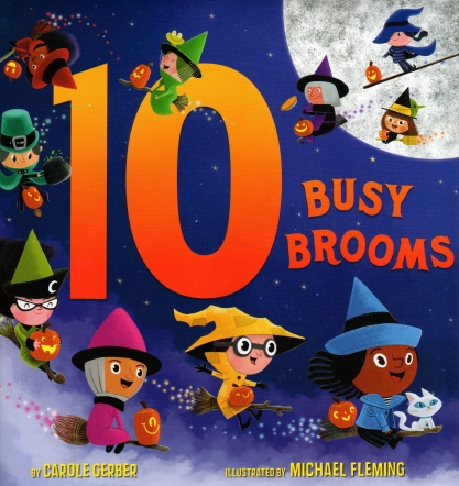
I’m no expert, but I’ve noticed covers have changed over time. They seem more eye-catching, and more frequently use photographs and bright colors. My daughter, a reluctant, yet excellent reader, wanted to tell me all about this new book she found, one she finally was enjoying: The Babysitter’s Club (the old series repackaged). Well, mommy-teacher-writer lady just so happened to have a whole box of the series in the garage and pulled them out, thrilled to have reading material at the ready that she might like. She took one look at the old covers from the early 90s — hand drawn girls with scrunchies in their hair – and wrinkled her nose. “But why?” I asked, though I didn’t need to. It was the cover.
And so, as my first novel was set for release, one thing I most anticipated and feared was the cover design. My questions were many: Would I like it? Would I have a say? Who would do it? Would it catch the eye of the readers? The answers, I’m happy to say, were: yes, sort of, someone amazing, and you bet.
My editor included me in parts of the process, and explained the rationales for many decisions. Early on, I was asked for thoughts on the cover, my inspirations. Not having been involved in any of the meetings on design, I don’t know how much these images were considered, but the final product captures some of these themes, so I was happy.

Millais' Ophelia
One was Millais’ Ophelia, which I’ve loved since I saw it in high school. Is she dead? Is she not? Each flower is so delicate, as is she, floating down the stream, not fighting against her fate. Very much not like the Ophelia I had written, and yet this image is quite well known. The other was a grainy black-and-white still from the movie Walk the Line. Reese Witherspoon and Joaquin Phoenix are walking down the street with their arms around each other looking back as if someone has called out and snapped the picture, intruding on their privacy. Thematically, this stuck in my head in connection with FALLING FOR HAMLET. The characters I wrote live public lives, even the things they wish were private. Their relationship is scrutinized and captured during official interviews, on surveillance cameras, and by passers-by “lucky” enough to be near them as their world falls apart.
Over the summer, I was sent a series of possibilities, and was thrilled that the two the team at Little, Brown liked the most were the ones I preferred, too. One I loved had a floating Ophelia, but it wasn’t used because she seemed like she might be dead – which we know from page one isn’t the fate of my gal. Additionally, it wasn’t modern enough, which, though the image was stunning, made a lot of sense. The other one I thought was cool was the black, white, and red one used in the end, which captures the eye and is pretty darn sexy. In fact, some people found it a bit too much so (but more on that in a moment). Along the way, I was sent various versions where proportion and focus were changed, and found it amazing that small changes altered the result so dramatically.
So we come to the controversy of the skirt. My guy friends loooooove the skirt. Independently, a few of them actually took my laptop and tipped it, like we were in Harry Potter world and they’d be able to catch a glimpse of her underwear. Boys! However, word from some librarians and teachers was that it was too short, and that they wouldn’t recommend it based on this fact. So the designer lengthened it and removed some shadow. It’s still short, mind you, but less scandalous, it would seem.

Me very happy when I first held the ARC in my hands
Will this cover sell the book? I don’t know. Would it make me pick it up in a store? Heck yeah. Does it capture some of what I wanted to say in writing about an independent, strong, and yes, sexy Ophelia? To me it sure does. There’s a lot that has gone on (gathering blurbs, which section of the text to use, how the summary was written) that I don’t know about. But in the end, it all turned out great, which is quite a gift for my first book.


Great post, Michelle!
Yes, of course we judge a book by its cover! Kids do as well. Soon after I got my contract, my kids starting giving me advice about my cover–make sure it’s colorful, interesting, etc. Like you, Michelle, I am excited and nervous to see my cover–akin to meeting the baby when you’re pregnant.
My 16 year old daughter loves this cover of HAMLET–I showed it to her the first time I saw it and she said, “That looks really good. When will it be out?” From the mouths of babes, as they say!
LikeLike
I remember those Babysitter’s Club books! I tore through them despite their awful covers. Now I’m curious whether kids who grew up on computers have a different sense of what makes a good cover than people who didn’t, or at least whose formative years weren’t spent on YouTube.
LikeLike
I love this behind-the-scenes story about the cover, especially learning how much input you had. That skirt story cracks me up! Man, I can’t imagine it beforehand. Thank you for sharing this peek into publishing, Michelle.
LikeLike
The picture you see is the OLD one. The new one is different — longer skirt but still cute and sexy. I wish I could post it but I don’t know how to change a pdf to a jpeg (or whatever one would need to do).
I really don’t know how much my input was used to be honest, but I felt included in the process, which was nice.
LikeLike
At this point, all I know about my cover is that my name will (probably) be on it. I know that the title is going to change, and without even knowing what the title is going to be, I have a hard time imagining what the cover will be. I do fantasize about it though, but I try not to let myself fantasize too much, because I don’t want to get an idea in my head that ends up hugely different from what actually appears. I hate it when I have a mental picture of someone I’ve corresponded with and then they turn out to be totally different, so I don’t want that to happen to my book 🙂
One thing’s almost certain though. Since my book is set in 1901, there is probably very little risk of a too-short skirt on the cover….
LikeLike
Michelle, I saw the long(er) skirt version on Amazon–still a keeper! It’ll make for a fun story at school author visits, I’m sure. 🙂
LikeLike
Pingback: What You See is What You Want to Get | EMU's Debuts
Interesting, I wouldn’t have thought twice about the skirt. But then, the Katy Perry video that was axed by Sesame Street didn’t phase me either. (My pre-schooler thought Katy’s dress was pretty.)
I can see why you love your cover. So enticing!
LikeLike
Most definitely that cover will sell your book! 🙂
LikeLike
I love this cover, and I can’t wait to read this book!!!!! (I’m trying to sell my own Shakespeare adaptation right now, so I really really want you to succeed!)
This is a really interesting topic that I’ve been mulling over for my own blog – and I hope you’ll come by when I get to post it – because I felt terribly misled by the title/cover combo of “Dating Hamlet” by Lisa Fiedler (less so by her “Romeo’s Ex” but still…). “Dating Hamlet” made me expect something modern and lighthearted, and the cover art supported this; I went into it thinking it would involve maybe a high school production of the play as the “Hamlet” connection. I could not have been more wrong! I know that authors don’t have a lot of control, but I think I would have kicked and screamed if I were her!
LikeLike
You have a point. A catchy cover that sells a book, but misleads the reader can turn off a reader as well as draw them in. I remember once reading a book that had a really steamy sex scene excerpt printed on the back cover, and I hesitated to read the book because I wasn’t looking for a lot of steamy sex. As it turned out, it was the only sex scene in the entire book (steamy or otherwise) and I remember thinking what a risk that was–if I had been looking for a bodice ripper, I would have been really annoyed, and they almost lost me as a reader because of the way it represented the book. Cover images can do that too.
LikeLike
Pingback: Sunday Salon: Cool Covers | The Nerdy Reader
Pingback: Covers: The Wisom Behind the Obsession | EMU's Debuts